Customizing a profile page within the hugo site.
It’s been a couple of weeks since I’ve worked on the Hugo site. However, I came back to it today to work on building out the Portfolio page that I created as a placeholder in the past, to get this site closer to something I’d be more comfortable sharing with the world. I started by filling out details within the placeholder markdown file I created before. Here were my goals:
- I did not want this to simply be an online resume. I may add this to the site later.
- I wanted to keep it to be a more high level description of my current skills, the skills I am working to develop.
- I also wanted it to include and a brief summary of certifications, career history, education, and how to get in touch with me.
Changing the page from ‘Portfolio’ to ‘Profile’
After creating my page, I realized that Portfolio was the wrong term to describe the contents of the page. Therefore I changed it to Profie by performing the following actions:
Changing the references within Hugo
In order for the name change to appear correctly and to update the references within my site, I made the following updates within VS Code (though you can use whatever tool you prefer for editing your files):
- Under content within my Hugo file structure, I changed the folder name from portfolio to profile.
- Under public, I also changed the folder name from portfolio to profile.
- Within hugo.toml, I changed the references to my portfolio page to now be profile

- Within my profile/_index.md file, I changed the title reference to now read profile.
Customize text layout
After deploying my page and making the changes to now reference profile, I realized I did not like the format of my page. I had used the list layout originally, but it had all of the text center-justified. To change this to left-justified, I updated the layout to single.
Note: The existing layouts provided within the template for this theme can be found within the Hugo file structure in: public/themes/ananke/layouts/_default.
Perhaps in the future I’ll work to build out a custom profile, but for now I’m happy with the fact that the single profile allowed my text to be left-justified.
Widening the space for the text body
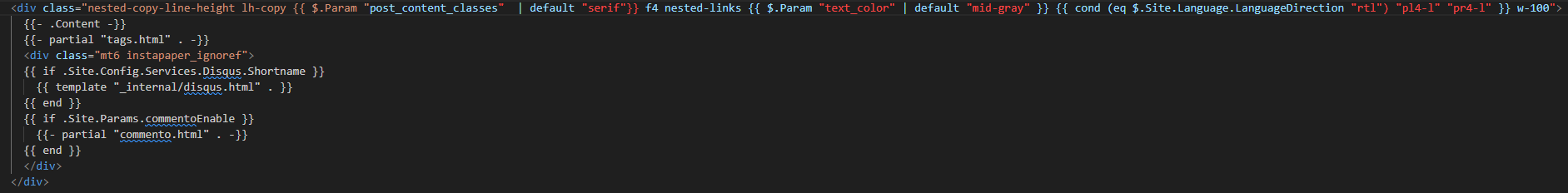
One thing I didn’t like with the single layout was that the text field for the body area did not fill up the page and looked off-center underneath the header. This is not good for someone with OCD like me. With a little bit of research (thanks GitHub Copilot!), I was able to find the correct value to update within the single.html file located in the layouts/_default folder referenced above. Based on pre-existing knowledge, I figured this would be a CSS update, but it was helpful to know exactly where to look using a quick prompt.
Within the div class attribute for the body (screenshot below), I updated the value at the end of the statement from w-two-thirds to w-100, effectively changing the text box size from taking up 2/3 of the space to taking up the full available default space (100%).
Too many headers
The text is now aligned and formatted in a format that I like, however now I had the Profile header appearing 3 times. While the department of redundancy department has their value in the world, this didn’t look good.
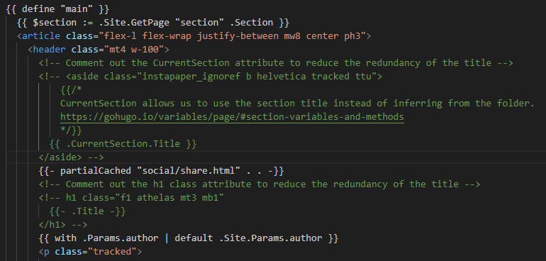
To change this I made the following changes within the single.html file, effectively changing the way the template looks for any page that uses this profile template:
Comment out the CurrentSection and H1 value:
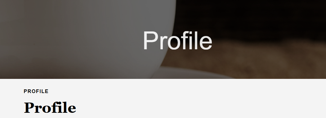
I am now happy with the look of the profile page.
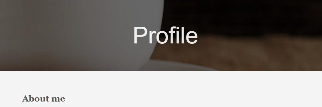
View the Profile page
The live profile page is now live at: Profile
Learnings
While most of this was just clerical updates to different files within my site, I was also able to get more practice with customizing different areas of the Ananke template to make the site look how I wanted.